MATLAB / Octave Tutorial----Chapter 3----Visualising the data(Part 1)
Chapter 3: Visualising the data
Part 1
In this chapter, you'll come to know how to record your data and visualize it in the form of graphs. This chapter is of special importance as dealing with data is one of the prime aspects of MATLAB. However, before learning how to plot graphs, we must learn in detail, about the basic data structures of MATLAB, i.e., vectors and matrices.
Vectors are one-dimensional arrays. It consists of space-separated or comma-separated elements. An example is shown below:

Demonstration of vectors in MATLAB
Matrices(singl.: matrix) are 2 dimensional arrays. It is declared as shown below:

Demonstration of Matrix in MATLAB
Each columns in a matrix is made using space separated or comma separated elements and each row is made using a semicolon.
Like in the above example, A = [1 2; 3 4; 5 6]. The semicolon is placed after every two elements, with means, the first two elements are row 1, next two are row 2 and so on...
Indexing
Array indexing in MATLAB is slightly different from that in C/Java etc. In those, array index begins with zero(0). But in MATLAB, it begins with one(1). This is shown below:

Demonstration of array indexing
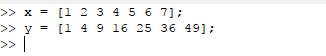
Now, we shall slowly dive into visualization of our data. For that we have to have two sets of data; one for the x-coordinate and the other for the y-coordinate. Lets take an example from the following data set:
x
|
1
|
2
|
3
|
4
|
5
|
6
|
7
|
y
|
1
|
4
|
9
|
16
|
25
|
36
|
49
|
For plotting the above data, we have to declare two vectors x and y as shown below:
We use the plot function to plot the two data with x at the x-axis and y at the y-axis.
Syntax for plot function is : plot([x-axis data],[y-axis data])

The entire sequence of steps is shown below:

Demonstration of plot function
Here are some of the ways you can play with the plot command:
1. axis: this command is used to limit the x and y axis limits, i.e.; set the min and max axes values. Syntax: axis([x-min x-max y-min y-max])
2. x-label, y-label, title: Give the axes some names and also give a title to the graph. Syntax: xlabel('X label string'), ylabel('Y label string'),title('title of graph')
The demonstration of the above commands is shown below:
Hence, we come to the end of this chapter. Try to plot your own set of data and see the result for yourself. This is just the 1st part of this chapter. We shall cover more and more details about Data Visualisation in the forthcoming lessons. Happy Learning!!!!
N.B. : Don't forget to comment about any queries you need to know.


Comments
Post a Comment